Forest Lady Blue- Walk-through and Thoughts
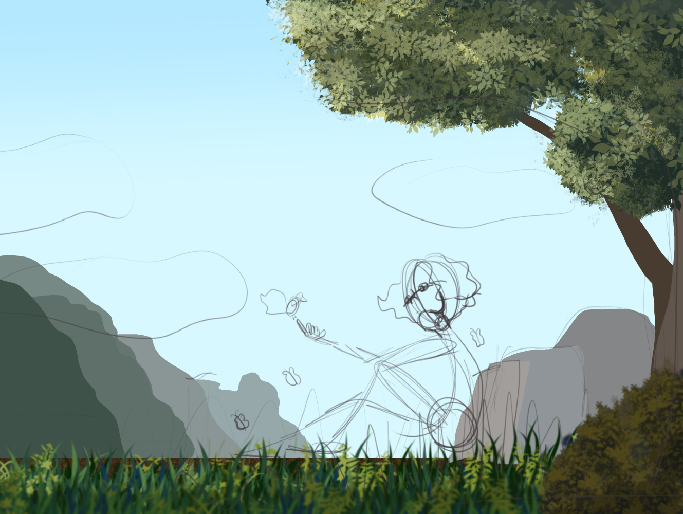
I initially started with a rough sketch idea. Some of the sketch is still visible. Prior to this when it is just a sketch I feel pretty excited and hopeful about the piece. In my head it is full of light and feels and most importantly finished. The next step shown above is where I start to lose all hope of that. This is usually the point where (at my current skill level) I realize my vision and current skillset don’t match and HOLY CRAP I don’t know how to paint or draw anything.
Then I pull out one of 100s of brushes that are like stamps and play around. At this point the desire to quit is high. I don’t like how everything looks like a stamp and I don’t know how to get from the idea in my head to where I want to go. At this point I usually go and get lots of reference and get inspired again to keep going.
I looked up references on skin tones and found something surprising about darker tones.
TIP
Instead of just going darker with colors to mimic darker skin tones- which (for me at least) resulted in hard to see features and details- instead go with a dull/desaturated purple and build from there.
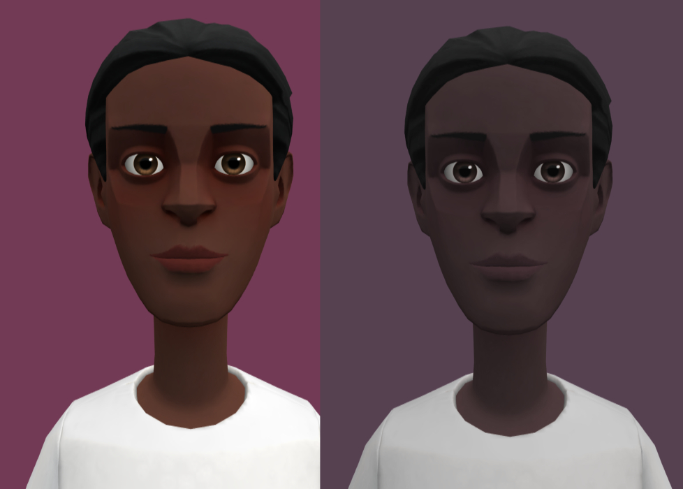
I start by saying I’m no skin expert but this so far has helped me. The characters are the same. The one of the left I copied to the right and turned down the luminosity and saturation and shifted the hue a bit toward purple. At this point the one on the right would be ready for me to add some life to it with more reds, greens and colors to reflect the environment situation.
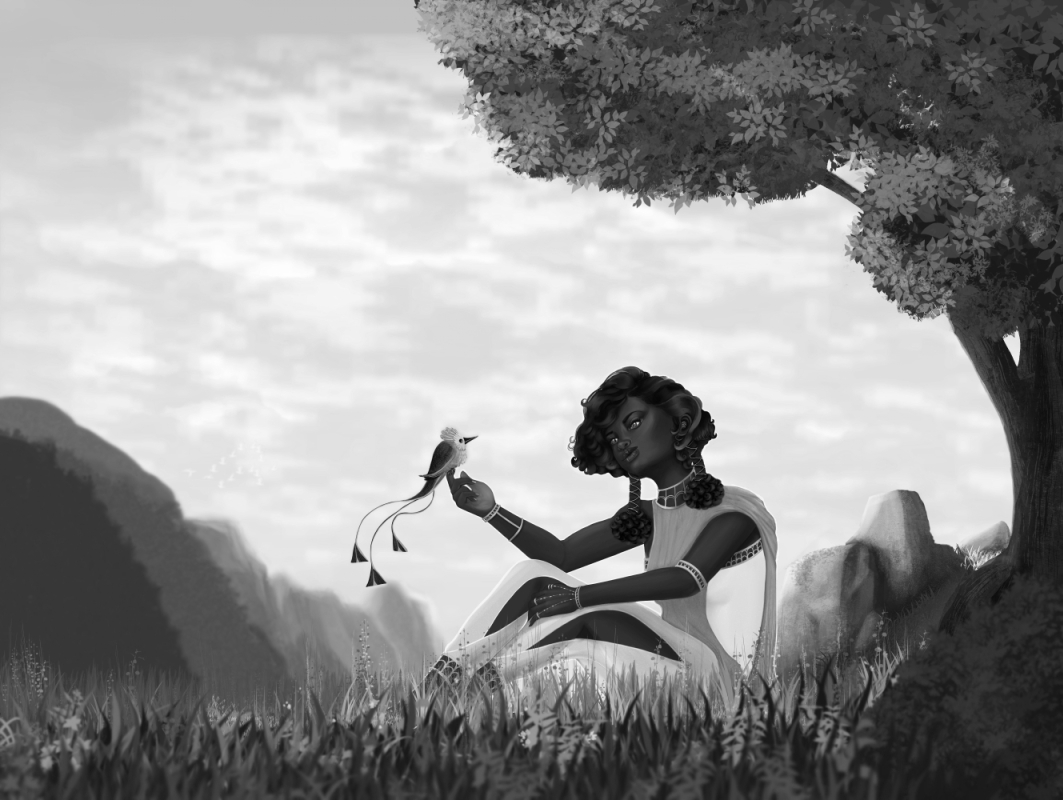
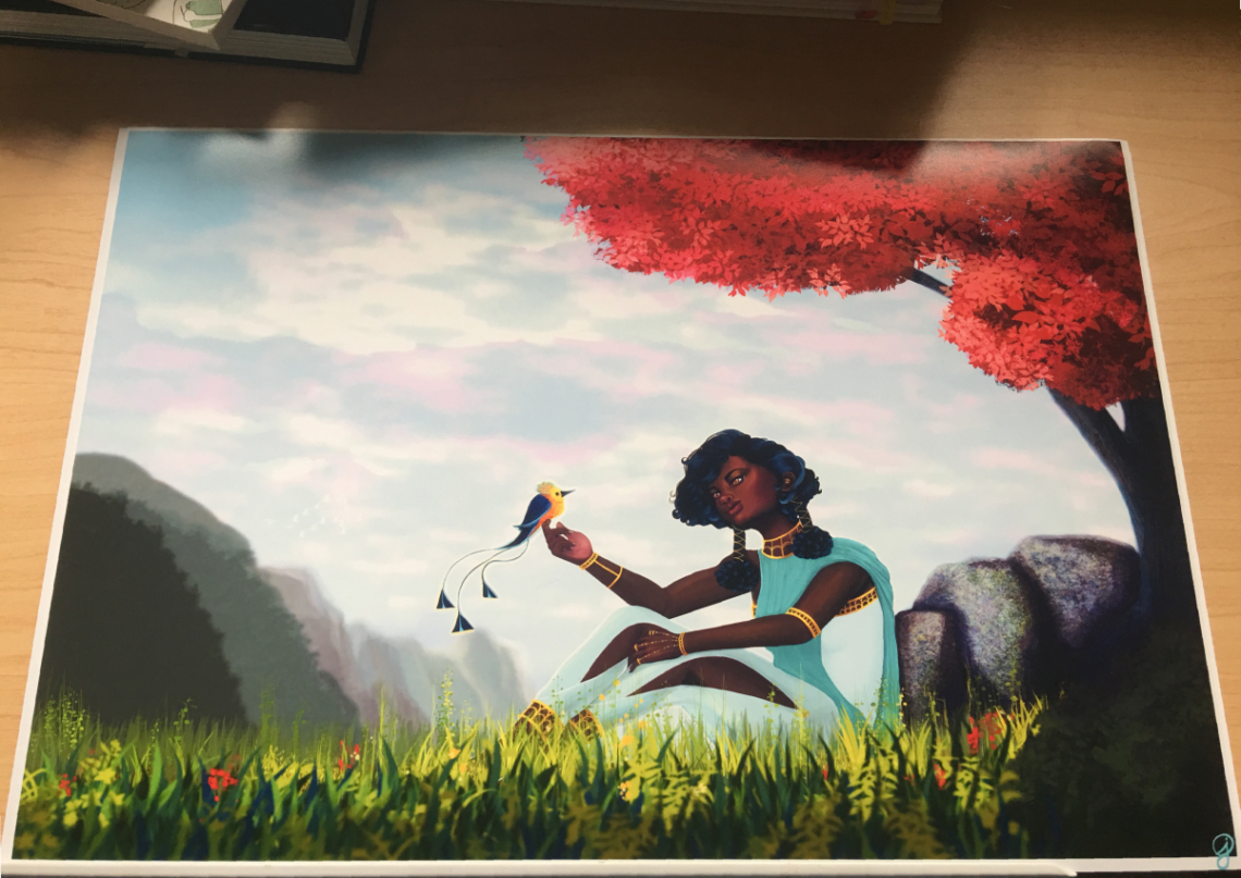
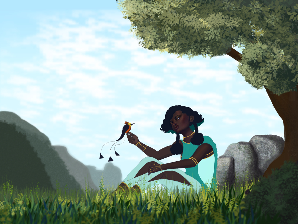
I continued working with the female and bird. Mostly I was ok with how this turned out and feel like this will be a good piece to see how far I’ve grown in a few months. I spent a lot of time on the rocks and still didn’t like how they turned out. I added noise, played with additional texture layers and colors, and eventually decided finished not perfect would have to be the goal.
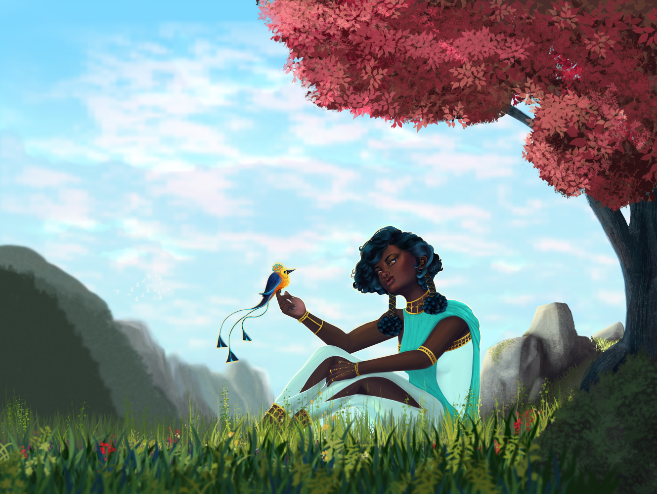
Following an excellent tutorial provided with Frankentoon‘s equally as excellent brush pack I did an alternative version.
TLDR; I like the original idea- magical female sitting peacefully out in nature communing with a fantasy bird. I like how there is a bit of depth in the picture. I really like how her skin turned out and the pants, and some parts of the jewelry.
Things I didn’t like as much- I’m not sure why I tended to end up on the more saturated part of the color wheel. There could have been more depth. The bird ended up not being what I wanted. Those rocks- sigh. The sky is kind of bland. The thing that I would fix most would be the lighting. I definitely want to repaint this when I reach a higher skillset. Color aside I can more easily see where things are pretty flat. These are all things I will try to keep in mind for the next one!