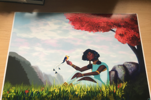
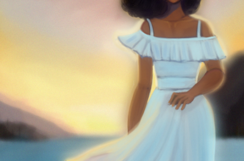
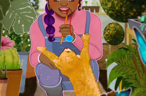
Portrait Practice


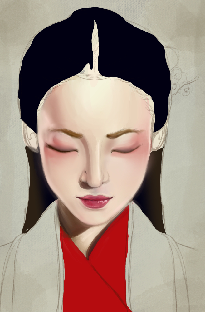
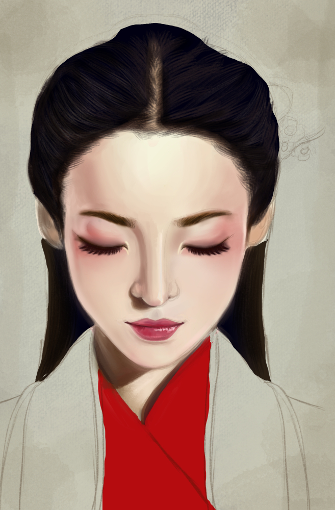

For this I wanted to try something new. For image 1 I took my time sketching out a rough-ish outline. Since the light seemed to be hitting her strongest on her forehead I went ahead and did a gradient fill trying to get in some yellows and pinks. After that I looked at what colors I thought I saw in her skin tone and kind of amped those up a bit. I used the lasso tool and fill bucket. I really liked this stage because it was really loose and helped to create a color roadmap. Next in step 4 I lowered the opacity of the rough colors and used the airbrush, textured blender tools, and various brushes.
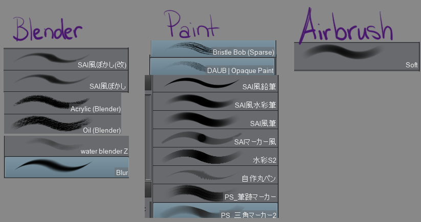
(Most of those I got for free from the CSP Asset store except for the Bristle Bob and Daub one). I probably could have used fewer brushes but I often just picked one to help create the texture I wanted. Some of the brushes were too smooth or too textured so I would switch back and forth using opacity and pen pressure to even it out. I didn’t want it to look too airbrushed or plastic. From there I just kept referring back to the reference picture (Pinterest Pin here) I would often stop to create a new combined layer to check out my values and compare them to the original ref picture.
Overall I’m pretty pleased with how this turned out but it took a really long time to get the sketch done and was my least favorite part of the whole thing. The lassoing part was perhaps my fave for how quickly it went by.
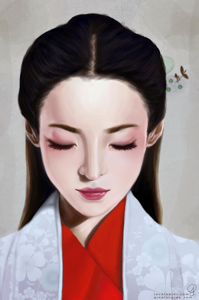
The finished version after some color editing in Affinity Photo. Total time around 7-10 hours.